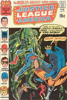
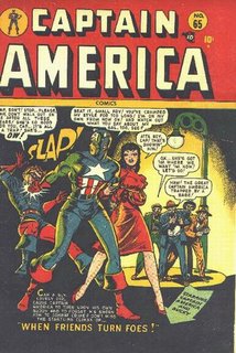
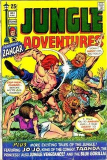
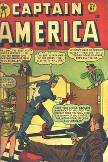
The JLA and Captain America 'slap' cover are my favorites of this group for different reasons. The weird scream of joy from King Batman just takes over the entire cover. The Cap cover with the backhand up Bucky's head is hilarious. The slap alone would have been sufficient but the text crowds the art. The Jungle Adventures #1 cover is pretty good. Again, way too much text but you can't help but like a cover with a word balloon that contains gems like this: "I told you to ambush him! I said death to Zangar!" It's a crowded busy scene but it has a whiney bad guy and the company logo is a street lamp with hanging signs!
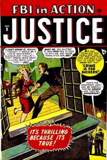
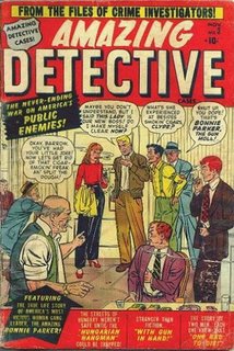
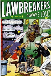
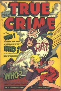
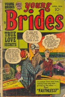
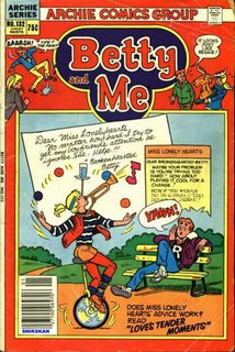
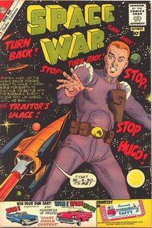
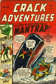
In all the art I browsed the ones that have the most poorly placed and wordy text are from the old crime comics lines. Perhaps because an attention-grabbing teaser story had to be told right upfront in order to make a sale and make one book stand out from all the others in a crowded newstand rack.


yup, GCD

Zangar has some very oddly placed nipples...
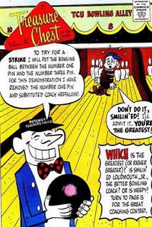
ReplyDeleteSome of these covers are so text heavy even Chris Claremont would be urging them to cut back a bit.
ReplyDelete