According to comic book legend, back in the Silver Age when it took months to determine what were the accurate sales for comics and the battle for rack space was extremley cut-throat, one publisher tracked in great detail what type of cover resulted in the most sales. Oddly, it turned out that covers that featured monkeys, no matter how ridiculous the teaser, sold more than the ones that did not feature them. Hence, the large number of primate-themed comic covers through the 50's and 60's and the interest in the sub-genre of what has been come to be called "Monkey Covers" in comic circles.
I can certainly understand it. After all, when it comes to monkey comic covers this is my absolute favorite...
-image from from the GCD
I rarely buy a book because of the cover but Strange Adventures #125 is an example of where I break my rule. This issue is different from the style of alien invaders that just happen to look like traditional snowmen, which I would purchase just for the straight-faced absurdity of it. This issue is just has a freaking great picture. Giant, alien, winged gorilla attacks planes and plucks them out of mid-flight. Hard to beat the sheer awesomenessity of that.
A comic or book doesn't necessarily have to have the whole package for me to enjoy it.
There are many examples of comics and books where the cover eclipses completely the interior art and story. The cover is what a potential customer sees first and many a sale is made or broken when a buyer is motivated to pick up a particular title because of the art. Most fans have become wise to the bait and switch of a hot artist doing the chores on the on the cover only to disscover the artist who drew the story is not the same as the fan fav who drew the outside. The late 1970's was notorious for it, particularly at Marvel. There was many a Frank Miller cover that featured awful story and art on the inside. For many this was acceptable as any Frank Miller product was welcome and desireable. I, for one, did not appreciate the fake out. Don't advertise that Miller is doing the book when the story is drawn by Ditko and Colletta having a bad day.
DC's unoffical 'house artist' Neal Adams did literally hundreds of covers that eclipsed the often silly (even by the standards of the 60's and 70's) interior. Browsing the score of covers done by Adams I'd almost say that DC invented single-handedly the concept of the Cover Disconnect, where the cover barely represents what happens in the book. The idea of the disconnect, by the way, is different from the Showcase Cover, where the characters are in a generic pose or situation that could be slapped on any month of that title and mean nothing. See almost any cover of Ultimate Spider-Man for examples.
Today, comic companies are in most cases, as a matter of survival, making sure that a possible customer knows exactly what creative team is working on the book from first to last page. For example, artist Alex Ross is one of the few artists that can sell a book based on the cover art alone and is often used as a selling point in advertising.
There are other comics and even books that I purchased just for the cover art, which I considered a story in itself. It didn't matter if the interior work was weak because I thouroughly enjoyed the exterior and accepted the cover as a story in itself. A comic worthy of collecting just for the cover is of course the iconic Wonder Woman #72 by Brian Bolland. Anyone remember the story? Not me. I didn't know anyone who bought it that month for the tribulations of Wondy. We couldn't care less. But boy, did we have to get it for the Bolland! Mike Kaluta did a series of particularly creepy covers for House of Mystery that were worth the purchase price alone and are suitable for framing. There wasn't a single issue of HoM I purchased back then for the stories. In the 70's Ballantine books published a series of HP Lovecraft anthologies that I would have bought even if I was not a fan of the genre. The cover art was done by artist John Holmes, who also did a rock album LP with art that was similar to the Ballantine efforts.
These books, long out of print, are hard to come by and sought after by collectors.
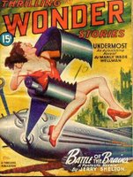
Pulps are another source for great cover art that is superior to the main product. While I really want to read the interior stories as a collector I am reluctant to remove them and risk cracking the brittle 30's and 40's era cheap paper and seperating the pages from the spine. Dreams' End is a favorite pulp cover of many, including myself and I purchased it the moment I found a good copy. Again, this was collected for the cover art alone. The bonus was that I also enjoyed the story. This issue of Thrilling Wonder from 1946 is the first pulp I ever owned, and was obtained only because the classic "good girl in peril" cover caught my eye. That Manley Wade Wellman, author of the amazing 'Silver John' stories was also featured in the issue was incidental.
Returning to the subject of ginormous primates, check out Big Monkey Comics, a chain of comics (and more) retail stores run by the brains behind Seven Hells! and The Absorbascon. From what I can tell these places aren't some mildewed holes smelling of poo-gas decked out with cast-off bookcases from their Mom's basement, so check it out.
From the site and this seems neat...
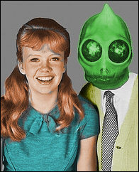
It has some fun features, such asTell 'em Sleestak sent ya!
- RSS feeds from comic book newsites
- a blog (The Big Blog) to which Devon and I and others contribute
- comic book reviews by Devon and some of our expert friends
- store info and sales (gotta make a living!)
- the Astounding Stupid Quote Balloon!
- a very easy way to listen to Big Monkey Comics Radio (formerly SuperHero Radio)
- links (of course) to our Ebay store and on-line Monkey Merchandise store
- Devon's Pick of the Week and Recommend Readings
- Two fan forums (FanFatale for women readers and Comic Book Issues for general topics)
Tags: Pulps Monkey Advertisement


Admit it, you would have bought Gorilla Witch simply on the strength of the title.
ReplyDeleteI would have, and I'm still thinking of it. I see that splash page you sent everyday.
ReplyDeleteCreepy new avatar you have, btw?
When I was a widdle Amber I had one comic I loved. LOVED I tell you! It was Animal Man (I think? Something-Animal title at least). This blonde guy was looking at a chicken egg that a dinosaur was hatching out of!
ReplyDeleteDinosaur! Chicken Egg! Weird blonde guy looking shocked! I loved that cover with all my heart!
And yet I never read the comic itself. I was a weird kid.
The new avatar is Candy Frankenstein from my novel. kawaii, ne?
ReplyDelete