Showing posts with label Art. Show all posts

Sunday, December 04, 2011

Remember those days?

THAT PERIOD WHERE FRANK MILLER WASN'T DRAWING MUCH OTHER THAN COVERSBECAUSE MARVEL KNEW WE WOULD BUY ANYTHING BY FRANK MILLER WITHOUT CHECKING THE INTERIOR ART FIRST

I would have bought this issue anyways because ROM that's why!

Saturday, December 03, 2011

Wednesday, November 23, 2011

When Dinosaurs Ruled the Earth

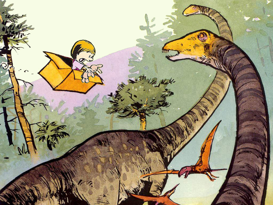
Oh, no! Susie Derkins and Mr. Bun have taken an unscheduled trip into the past to when dinosaurs ruled the Earth! Calvin should not have left the keys in the time machine for just anyone to stumble upon but then again he isn't the most responsible little guy.

I was nostalgic for Calvin and Hobbes so I threw this image together as a lark. The idea that Calvin would just shrug and go play when he discovered his time machine was missing tickled me. Only Hobbes would be likely to show some curiosity or concern when he realized Susie was also nowhere to be found. He would have to badger Calvin into a rescue mission, the result being that both of them would probably get sidetracked by mutants, homework and clones until long after Susie made it back to present day on her own, no thanks to Calvin and his tiger. I just wrote 2 weeks worth of dailies and a full color Sunday strip in my head just now.

All original art elements by Bill Watterson and amateurish cut-and-paste by me. If he sees this I hope he approves.

Monday, September 05, 2011

iKirby

My birthday is this week and in celebration my lovely wife purchased for me an iPad. I'm not crazy about (a) the price and (b) the DRM but she received a substantial employee discount from her work that brought the tablet down to a reasonable price. I have to admit the tablet is a lot of fun. I don't have the kind of job where I will use it for work so it will primarily be a source for entertainment though it does have some useful tools available. The tablet is easier to carry around than a laptop and larger than a phone so it is in my "Goldilocks Zone" for personal devices. That is, it is just right.

The moment I opened the box I was determined to personalize my iPad before I looked for nifty applications and games. Being a comic book aficionado there is little better a source to declare your comic book geek cred than by displaying art created Jack "King" Kirby. The late artist and conceptualizer Jack Kirby is famous his work on Captain America, the ground-breaking run on Fantastic Four with Marvel Comics and his Fourth World space opera saga for DC Comics. Jack Kirby routinely drew over-the-top, rule-smashing spectacle that sometimes was not appreciated in his day. But even during those periods when some companies and readers didn't always support Jack Kirby's output he always had fans who never let him or his employers forget just how much they appreciated him.
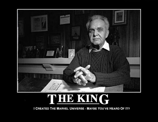
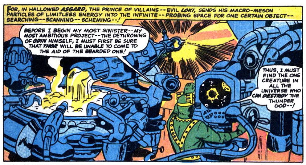
There are few creators in the comic book field past and present that could get away with the artistic stunts Jack Kirby routinely excelled at. Those that try and succeed usually emulate Kirby's unique line style or layouts. Other than unique characters and landscapes Kirby also drew fantastic, impossible and arcane machines that in one story operate by magic and others via super-science, though Kirby often made no distinction between the two, particularly when it came to his depictions of the Asgardian gods in Marvel's Thor series.
Jack Kirby drew for the floppy. In his day the trade paperback consisting of many collected stories was rare and as a concept was underutilized. Kirby didn't generally create art that would serve a purpose much beyond that month's entertainment in what was then considered a disposable format, the comic book. Much of today's comic book art is created with multiple forms of formats in mind for immediate use specifically designed to fully exploit other forms of media. As a marketing tool, an entire industry exists just to supply fans with the extra art and prose outside of the regular periodicals to fulfill their needs. One of the most popular and easiest image types to be found are those created as background pictures for phones and computer monitors, commonly known as "wallpaper". There exists plenty of comic book covers and pages created by Kirby that would serve as a good background image to express my appreciation of the King but a die hard fan such as myself wants something unique.
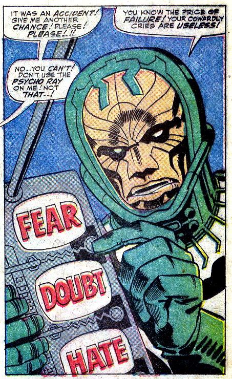
I had something definite in mind for iPad wallpaper but I couldn't find anything suitable outside scans of Kirby panels. The closest I came to what I wanted was some fan art in the Kirby style. Cool images to be sure but not precisely what I was looking for. What I really wanted for my iPad wallpaper was the ultimate Kirby gadget: The Control Box, the emotion-controlling weapon wielded by the 1960s Fantastic Four villain the Psycho-Man. In the Marvel comic books the Psycho-Man is a despot from another universe who uses the emotions of fear, doubt and hate as weapons to terrify and manipulate human beings, torturing them until they become subjugated to his will. The Psycho-Man has been an semi-recurring character in various Marvel series since 1967.

Looking around the web I found only a few fan-made Kirby-inspired images of the "Mother Box" device designed for the cellphone. The Mother Box is a sentient and benevolent computerized nanny that guides and assists both the good and evil New Gods of Jack Kirby's Fourth World series. Examples of the Mother Box for the phone can be found here and here and here.

My searches for a suitable image of the Psycho-Man's Control Box met with negative results so I decided to create one of my own. My photoshop skills are nearly non-existent but I thought I'd try to create my own Control Box anyway. Initially, I tried to emulate a comic book style of the Control Box but quickly discarded that in favor of a more realistic depiction.

Firstly, I chose a minimalist metallic wallpaper for the background. That gave the surface of the Control Box a texture that made it seem more real, as if it was cut and shaped out of some alien sheet metal in a hidden lab by some insane, cursing alien who muttered to himself, swearing dire retribution on all those who wronged him. Because you just know the young BEM who grew up to become the Psycho-Man got beat up everyday for his lunch credits at Microverse Junior High. After that I created the FEAR, DOUBT and HATE status screens, throwing in some drop shadows to make them appear 3-D. For the control switches I used a standard power button image. I chose a green light for the button because there was enough red adjacent to it.

I then embossed a couple of over-lapping trapezoid shapes on the left side, cut out some sections and added some more generic control buttons. I created a couple of textured surfaces for the right and left sides to add depth. Of course the Control Box would not have that special Kirby touch without some gratuitous zig-zag lines running across the surface. This was for me the most difficult part of creating the Control Box. Initially, I intended to make some curvy lines but the simplistic line art distracted from the other more photo-realistic parts of the Control Box. I considered a more 3-D effect by inserting a wave-style bike rack into the image but again, I didn't like how it fit into the overall style.

Then I considered using standard circuit boards. Reversing the image of a circuit board would make any text on the surfaces appear sufficiently alien so the English words and numbers wouldn't be too distracting. I kind of liked the idea of Psycho-Man building a prototype Control Box showing exposed circuitry. But none of the ones I found online or had in the garage I scanned worked for me. I wasn't enthused about making a jagged or wavy circuit board myself as my PS skills would have made it obvious I shaped the image by deleting sections defined with a polygonal lasso tool.

I was kind of stuck with what to do to finish off the Control Box. It just would not do not to include the ultimate in stylized Kirbyism. Then I had the idea of using an image of a flexible printed circuit. Cutting and pasting the image of a length of FCB across the surface of the Control Box gave me that special Kirbyesque zig-zag of actual circuitry and I really liked the end result. So I loaded the Control Box image into my iPad and I couldn't be more pleased with how it looks. I've decided to share it with any other fans to put onto their phones or tablets if they want. So take a gander. Here is my re-imagining of the Psycho-Man's Control Box, created by Sleestak after Jack Kirby. Hope you dig it.

Psycho-Man's Control Box by Sleestak (after Jack Kirby)

Click picture for all sizes including Hi-Res, suitable for framing
Saturday, September 03, 2011

FREEEEEEE-BIIIIIIIIRD!

This simple drawing on a chopstick wrapper is a fine example of beautiful art under everyone's noses that is ignored or overlooked. Who could look at this bird taking flight, expressing such joy at quitting the Earth by sheer force of will and remain annoyed or angered or sad? And now, I share it with you. The world is a better place for it. You're welcome.

Regretfully, the artist that gave so much to the world will probably never be known.

From a local Asian eatery San Diego, 9-3-11.

Wednesday, August 24, 2011

The Record Bar

Decades ago when people wanted to browse, listen to and purchase music they had to leave the comfort of their home and journey miles away to a large department or specialty store to do so. One of the ploys used by stores to entice shoppers was naming the departments creatively. In some instances the music section was called the Record Bar (a practice that existed prior to the store of the same name). It was a way of differentiating the music department from the staid sections of necessities like shoes and clothing and implied luxury and fun. Hanging a sign that just read "Music Department" was too boring even though over the years stores have returned such naming simplicity even if made in flashing lights or neon. Calling a corner of a department store containing alphabetized shelves of long playing records a "Record Bar" promises fun, excitement and possibly illicit nightclub acts.

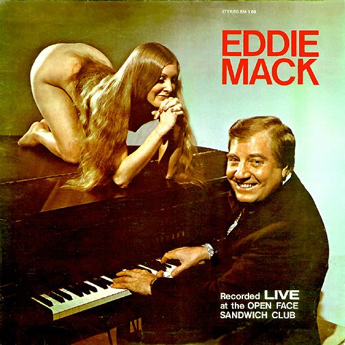
Other than branding a department in exciting ways what most promoted sales of LP's is the usually fascinating and sometimes lurid cover art. The 1950s and 1960s were famous for their cover disconnects, where the artists cleverly relied on sexual imagery to boost sales of polka or lounge music. The greatest disparity in using sex to sell LP's occurs in those categories of music that one doesn't normally associate with fun times and parties such as highway motel lounge ensembles, nightclub musicians and organ soloists.

While enough people went out to such places to justify employing them for a few decades no one really wanted to buy their music and take it home with them. Drinking a highball after a hard day of selling reverse-threaded screws to gas stations while decompressing in the orange and aqua booth of a Howard Johnsons doesn't usually make one wistful for the musical stylings of the guy at the piano that has a mop and bucket in view leaning against the turquoise burlap-covered wall behind him. Those purchases were typically reserved for the headline and more heavily promoted and polished acts that were marketed at the national level. So when browsing the aisles of the Record Bar the tired serf of the Camelot lifestyle had to be promised wild parties and lewd play times by way of a woman with large breasts who worships the man who plays the organ at the local park pavilion on alternating Saturdays.

Gilligan at Retrospace (from whom I ganked a few images) exhaustively details the practice of using sex to sell music and other products. Click the link to check out his entry on Cheesecake Album Covers. He hosts many fine examples and even more links to consumer-baiting LP covers.

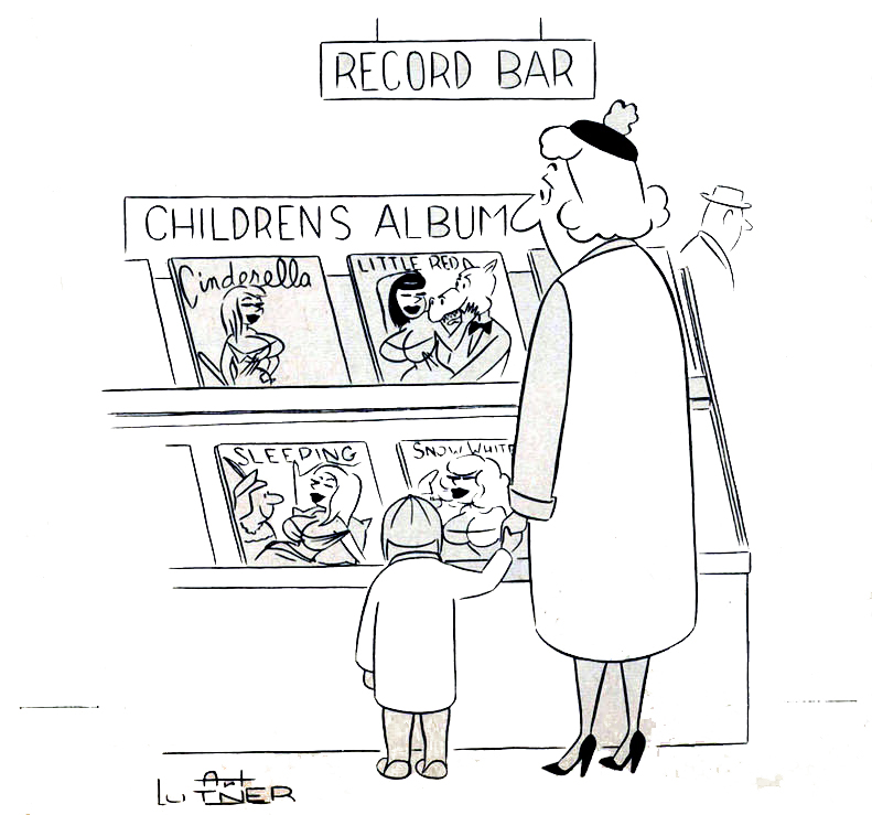
The following cartoon by Art Lutner from Bachelor #2 (1961) is a good example of the logical progression of the use of sexual imagery to sell records and would have rung true with most readers of the era.

While Lutner was making a comical statement about using sex to sell children's LP's he wasn't far off from reality. Quite often advertising for children's products is aimed at the adult who holds the money and has little to do with the content of the purchase.

Friday, August 19, 2011

From the Collection: Glory Lane

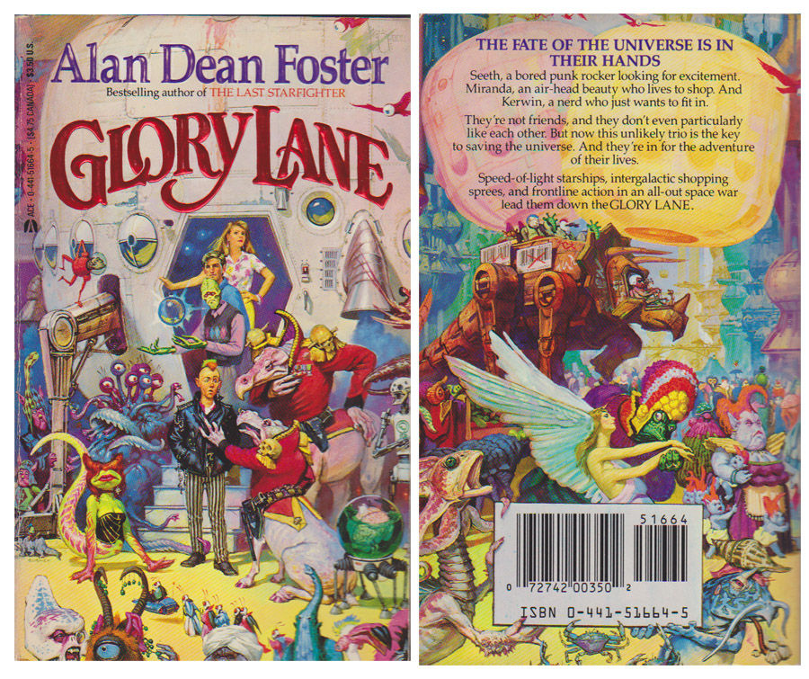
Alan Dean Foster rarely delivers a bad read and he typically adds a lot of depth to slim scripts in his adaptations of movies and other shows. His Flinx universe is a favorite of mine even though the publishers have been marketing the series the last few years as Young Adult and not mature science fiction.

Glory Lane is a fun time though it is the cover I find interesting. Not so much for the unique aliens crowding the interstellar bazaar but the fact that on the back cover the bar-codes in the background above the actual fourth wall-breaking UPC code were scribbled out. It's amusing to think that the publisher was concerned that 1978 scanning technology would have been interfered with by the faux codes in the background. It's also possible that the UPC labels on the mech-dino would have been the place holder for the actual UPC code given different art direction and layout if a close-up of the tourist transporting walker were discarded in favor of the UPC-toting aliens. If so, good thinking by artist Jim Gurney, planning greater flexibility in his art to decrease chances of rejection or having to repaint the scene.
Glory Lane (1978).

Wednesday, August 10, 2011

From the Collection: Stalker from the Stars

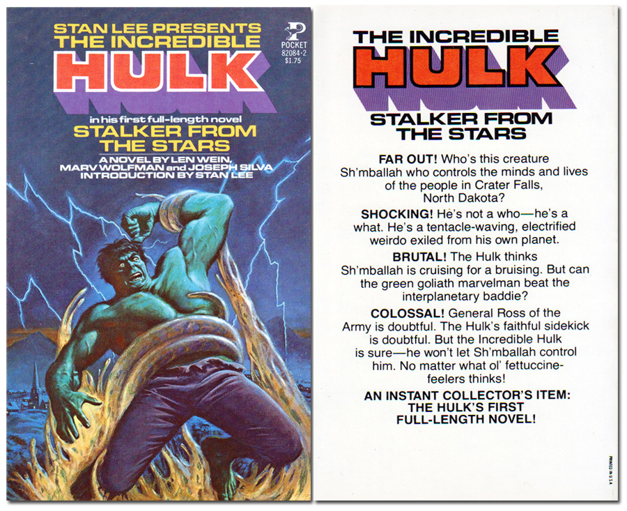
Those unfamiliar with Marvel comic book history would find the Hulk prose novel Stalker From the Stars reminiscent of cold war SF cinema but the book is really a blend of a 1950s Atlas/Timely alien invasion story (inspired of course by real world fears and concerns) featuring an un-evolved 1970s Hulk. This had precedent at the time as several Marvel heroes had come up against old villains from Marvel's SF and Horror books of the past. While the dialog of SHIELD agent Clay Quartermain made me want to travel to the Fictionverse just to beat him up overall the book is not a bad read for a young adult novel.

Front and back covers of Stalker from the Stars (1978).

Sunday, August 07, 2011

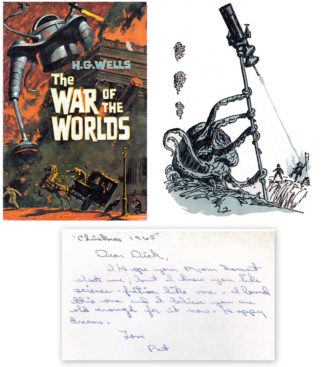
Don't you wish your martian was science-fiction like me

Click the picture to bring Mars closer to Earth!

Found in my copy of a 1964 Whitman Publishing edition of The War of the Worlds by H. G. Wells, the inscription reads:
"Christmas 1965"

Dear Dick,
I hope your mom doesn't shoot me, but I know you like science-fiction like me. I loved this one and I believe you are old enough for it now. Happy dreams.

Love, Pat

This edition has illustrations by Shannon Stirnweis throughout the book but most are rather generic scenes of people in Victorian era clothing standing or sitting around. The one standout illustration is the fatal first contact scene between the Martian invader and the Deputation team of Ogilvy, Stent and Henderson. I also dig the cover art and groovy SF typeset.

Monday, July 11, 2011

The Million-Dollar Pixie

Years before Cosmopolitan magazine became known as Cosmo and advocated that liberated, independent, strong, intelligent and powerful women keep a married man on the side to help pay the bills movie star Hayley Mills appeared on the cover, goofing around and reinforcing a young image.Cosmopolitan used to be a well-rounded periodical of not only light articles but some in-depth investigative stories as well. From the December 1962 cover Hayley Mills talks about how her family keeps her grounded, the ways the young women of Moscow are defying Cold War stereotypes of behavior and fashion and the growing number of adults who are taking care of grandchildren born by unwed mothers. I'd like to present the Hayley Mills family-centric article "The Million-Dollar Pixie" in its entirety but laying the magazine flat enough to scan the pages would cause them to separate from the binding. I'll leave that sort of damage to those who cut ads and art out of vintage magazines and sell them online. So instead of the fascinating Hayley article I'll present a few pages of interior artwork instead.

Like many other magazines of the time a lot of page space was filled with fiction and non-fiction stories. For my tastes it isn't so much the writing and authors that are of interest but the art and illustrations that accompanied the stories. Frequently the art is classic and highly skilled and is widely appreciated as a stylistic snapshot of the era. Of all the art in this issue of Cosmopolitan it is the two pages that accompany the "complete mystery novel" Snow Job by Malcolm Gair, illustrated by Mitchell Hooks that I like the most. I've got a thing for duo-tone (or nearly so) magazine illustrations.

He put out his hand to throw back the bedclothes, but Sally caught his arm in
her long tanned fingers and stopped him. "You're doped," she said.

When he got to the low point of the cliff, he looked up.
On top stood a figure with a large stone poised to throw.


Cosmopolitan changed in the way it did to stay relevant and alive by appealing to a young, trendy and orgasm-conscious female demographic. While not the New Yorker by any means it was not a bad magazine at all and was likely better than many it competed with on the news stands. The change in the magazine was a sign of what was happening in the publishing industry as a whole at the time. The fact is if Cosmopolitan didn't change to increase readers and ad revenue when it did it would probably have ceased publication decades ago and been all but forgotten. I'm glad that Hayley wasn't featured in the magazine during a time when the cover would feature "new" sex positions and ways to drive your man wild in bed.

Wednesday, June 01, 2011

Tuesday, May 31, 2011

Swingin'

For those seeking old books and LP records there are better places to browse than in San Diego.

One reason is the relatively young and transient population. Farther inland and on the other coast there are generations of collected belongings sitting in basements, attics and garages. Eventually one family member or other will dispose of the Grandparent's old furniture, books and music to the delight of treasure hunters of the region. In Southern California however, a lot of what is donated to thrift stores is late 1970s and 1980s music and tchotchkes. I've even discovered several decades worth of macaroni-adorned picture frames at one Salvation Army store.

The other reason San Diego is a poor resource for keen gear is the economy. Most of the used book stores have shuttered and the usual places one could find groovy LP's, the Goodwill and Salvation Army stores, have either combined all their resources into one store or done away with LP's altogether. While reducing the number of places the records are displayed makes sense for the business it hurts the shopper seeking cool stuff because multiple destinations meant that a browser could get lucky if his timing was right. All the LP's kept in one place means one faces constant competition has to be really lucky with the timing to score some choice items.

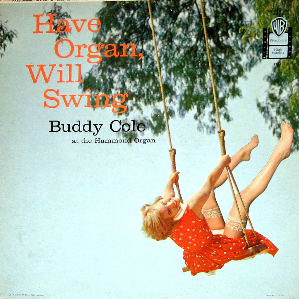
Recently I found a couple of Jonah Jones Quartet albums, Swingin on Broadway and Swingin' at the Cinema notable among the internet primarily for the pretty women on the cover. Of the JJQ discography these two albums are probably the easiest to find. I found multiple copies of each when browsing and purchased the two best of the lot. Oh, yeah...I agree that those stretch pants and curves, especially on the blond on the Cinema LP, are something else. The album art is pretty typical of the 1950s. Back then nearly anyone producing lounge-type music put an attractive woman on the cover because no one would buy an album featuring John Wilson and the Howard-Johnsons Off State Route 12 Experience on the sleeve. Sex always sold, don't get me wrong, but the producers of the lounge era LP escalated cheesecake and enticement into an art form rarely seen since. These particular albums are probably getting more attention now than before as the "Mad Men" style of fashion seems to be all the rage still. Too bad there are no model credits for the albums, at least none that I can find.
The music is good but not original other than the application of the JJQ style as they are covers of tunes already popular in the era. They are fun to hear as "lost" music and I'm really partial to their treatment of A Gal In Calico from the Cinema album. I think the Jonah Jones Quartet packed enough talent for a dozen musicians.

From the collection: Swingin' on Broadway (1957) and Swingin' at the Cinema (1958).

Friday, May 27, 2011

Something more than sexual

An album cover that makes me wish I was old enough to know you then.

The Immortal Ladies by The George Melachrino Orchestra (1956).

Wednesday, April 06, 2011

Improved by graffiti

I'm not the type of person who considers most graffiti as actual art. Banksy and others in that class aside the majority of the scrawls on walls and property is, cleverness notwithstanding, simple and ugly vandalism that is costly and deleterious to the area in which it appears.

The graffiti in my neighborhood, while full of pretty colors and large swooping letters, makes the street look like a slum. I don't get why people poop where they live.

One exception I found recently is a case where vandalism may actually improve a location. While eating lunch on a day out with my wife I discovered a vandalized painting of a still life of flowers hung up above a urinal in a bathroom of a local restaurant. The painting itself is of a class that some consider to be perfectly suited for hotel rooms and other areas like bathrooms. No disrespect to the artist, as it is better than I can do and is an improvement to the standard decor of air fresheners and paper towel dispensers.

Apparently, a few ne'er-do-wells had taken the time to scrawl their monikers on the painting, tagging it with their signatures. Shame. Vandalizing art is tantamount to burning books as far as I'm concerned.

Yet the vandalism is not the most unfortunate aspect of the painting. During flushing, fluids in a toilet become aerosolized and spread out about a yard or so in all directions. Due to the proximity of the painting to the urinal it is probable the art is toxic to more than the eye. The painting is a still life but I don't doubt that the surface is teeming with squirming, throbbing, icky, deposited nastiness. Worse, any person of average height using the urinal is positioned directly in front of the canvas, mouth a few inches away from the surface (on average, about six inches distant), breathing in and out, blowing colonies of bacteria and horror into the air and then inhaling them deep into the lungs and sinuses. So the good thing about the vandalism that mars the painting, the only reason when graffiti would improve something by damaging it, is that for esthetic reasons the painting is unlikely to be moved during redecorating to anywhere else in the restaurant. Like to the dining area.

Tuesday, April 05, 2011

Outstanding in his field

I'm really enjoying the new Avengers series primarily for the JRJR art though I'm not hating the story direction either.

In particular I appreciate this scene from Avengers #6 (Dec 2010) of Ultron standing at the crest of a pile of debris.

This panel conveys a real sense of horror and menace from the human-hating robot Ultron. In the past Ultron or any other villain, when shown as victorious, would usually be depicted standing in a vast control room or city that is an extension of itself. While visually appealing it also became somewhat of a cliche and usually the cause of the antagonist's defeat. A super-intelligent robot wouldn't really need to sit on a throne or connect to the internet though it looks good in CGI cartoons.

In the comic Ultron was placed in a scene where the robot's essential binary nature was revealed. Ultron is either ON or OFF, at ZERO or ONE. Having completed the directive to erase humanity from the planet Ultron stops in mid-step, inert until it is prompted to proceed again. Like an anti-life Roomba, Ultron apparently just walking the earth until the program was fulfilled, having extinguished all life. That's scary.

Monday, February 07, 2011

Art is Food

Great branding

My current dietary choices do not include chips and other snacks these days but I found this store branding of munchies clever and unique. The product is identified on the bag and draws attention by the cute doodles centered around a chip or cheese puff. As marketing goes it is a pretty nice effort and goes beyond what one usually sees for labeling for a generic store product.

There are several illustrations but my favorite is the potato chip mouse being threatened by a venomous snake.

Saturday, December 25, 2010

Merry Christmas and Happy Holidays for 2010!

Child Life #1 (1928)

Vintage art and a poem from Child Life #1 (1928). Words by Marjorie Barrows, art by Margaret Whitman.

Thursday, November 18, 2010