Wednesday, April 24, 2013
Terry Austin draws for Algol (1977)
Most people are familiar with the work of illustrator Terry Austin from his tenure in the comic book industry, most notable in the classic X-Men titles. Not many people are aware of or familiar with his other illustration work for magazines and books such as the contributions to the 1978 printing of I, Alien by J. Michael Reeves.
Illustration for Richard Lupoff's Book Week column published in Algol #17 (Winter 1977).
Posted by
Sleestak
at
4/24/2013 06:00:00 AM
0
comments
Labels: good girl art, illustration, pulp art, space pirate, terry austin
Sunday, March 31, 2013
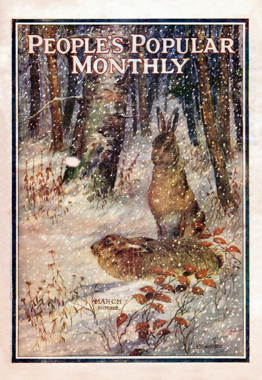
People's Popular Monthly (March 1922)
Posted by
Sleestak
at
3/31/2013 03:00:00 PM
0
comments
Labels: bunny, easter, illustration, magazine art, rabbit
Saturday, December 03, 2011
Dark Invasion
Posted by
Sleestak
at
12/03/2011 09:02:00 PM
1 comments
Labels: Art, illustration, Pulp
Wednesday, November 23, 2011
When Dinosaurs Ruled the Earth
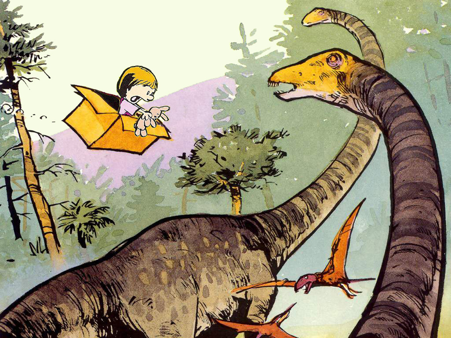
Oh, no! Susie Derkins and Mr. Bun have taken an unscheduled trip into the past to when dinosaurs ruled the Earth! Calvin should not have left the keys in the time machine for just anyone to stumble upon but then again he isn't the most responsible little guy.
I was nostalgic for Calvin and Hobbes so I threw this image together as a lark. The idea that Calvin would just shrug and go play when he discovered his time machine was missing tickled me. Only Hobbes would be likely to show some curiosity or concern when he realized Susie was also nowhere to be found. He would have to badger Calvin into a rescue mission, the result being that both of them would probably get sidetracked by mutants, homework and clones until long after Susie made it back to present day on her own, no thanks to Calvin and his tiger. I just wrote 2 weeks worth of dailies and a full color Sunday strip in my head just now.
All original art elements by Bill Watterson and amateurish cut-and-paste by me. If he sees this I hope he approves.
Posted by
Sleestak
at
11/23/2011 06:00:00 AM
2
comments
Labels: Art, calvin and hobbes, cartoon, illustration
Saturday, September 03, 2011
FREEEEEEE-BIIIIIIIIRD!
This simple drawing on a chopstick wrapper is a fine example of beautiful art under everyone's noses that is ignored or overlooked. Who could look at this bird taking flight, expressing such joy at quitting the Earth by sheer force of will and remain annoyed or angered or sad? And now, I share it with you. The world is a better place for it. You're welcome.
Regretfully, the artist that gave so much to the world will probably never be known.
From a local Asian eatery San Diego, 9-3-11.
Posted by
Sleestak
at
9/03/2011 05:45:00 PM
0
comments
Labels: Art, Grocery Store Artifact, illustration
Wednesday, August 24, 2011
The Record Bar
Decades ago when people wanted to browse, listen to and purchase music they had to leave the comfort of their home and journey miles away to a large department or specialty store to do so. One of the ploys used by stores to entice shoppers was naming the departments creatively. In some instances the music section was called the Record Bar (a practice that existed prior to the store of the same name). It was a way of differentiating the music department from the staid sections of necessities like shoes and clothing and implied luxury and fun. Hanging a sign that just read "Music Department" was too boring even though over the years stores have returned such naming simplicity even if made in flashing lights or neon. Calling a corner of a department store containing alphabetized shelves of long playing records a "Record Bar" promises fun, excitement and possibly illicit nightclub acts.
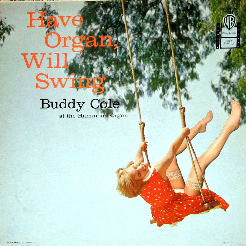
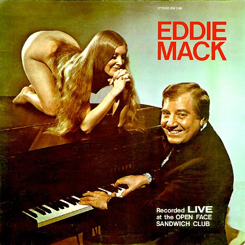
Other than branding a department in exciting ways what most promoted sales of LP's is the usually fascinating and sometimes lurid cover art. The 1950s and 1960s were famous for their cover disconnects, where the artists cleverly relied on sexual imagery to boost sales of polka or lounge music. The greatest disparity in using sex to sell LP's occurs in those categories of music that one doesn't normally associate with fun times and parties such as highway motel lounge ensembles, nightclub musicians and organ soloists.
While enough people went out to such places to justify employing them for a few decades no one really wanted to buy their music and take it home with them. Drinking a highball after a hard day of selling reverse-threaded screws to gas stations while decompressing in the orange and aqua booth of a Howard Johnsons doesn't usually make one wistful for the musical stylings of the guy at the piano that has a mop and bucket in view leaning against the turquoise burlap-covered wall behind him. Those purchases were typically reserved for the headline and more heavily promoted and polished acts that were marketed at the national level. So when browsing the aisles of the Record Bar the tired serf of the Camelot lifestyle had to be promised wild parties and lewd play times by way of a woman with large breasts who worships the man who plays the organ at the local park pavilion on alternating Saturdays.
Gilligan at Retrospace (from whom I ganked a few images) exhaustively details the practice of using sex to sell music and other products. Click the link to check out his entry on Cheesecake Album Covers. He hosts many fine examples and even more links to consumer-baiting LP covers.
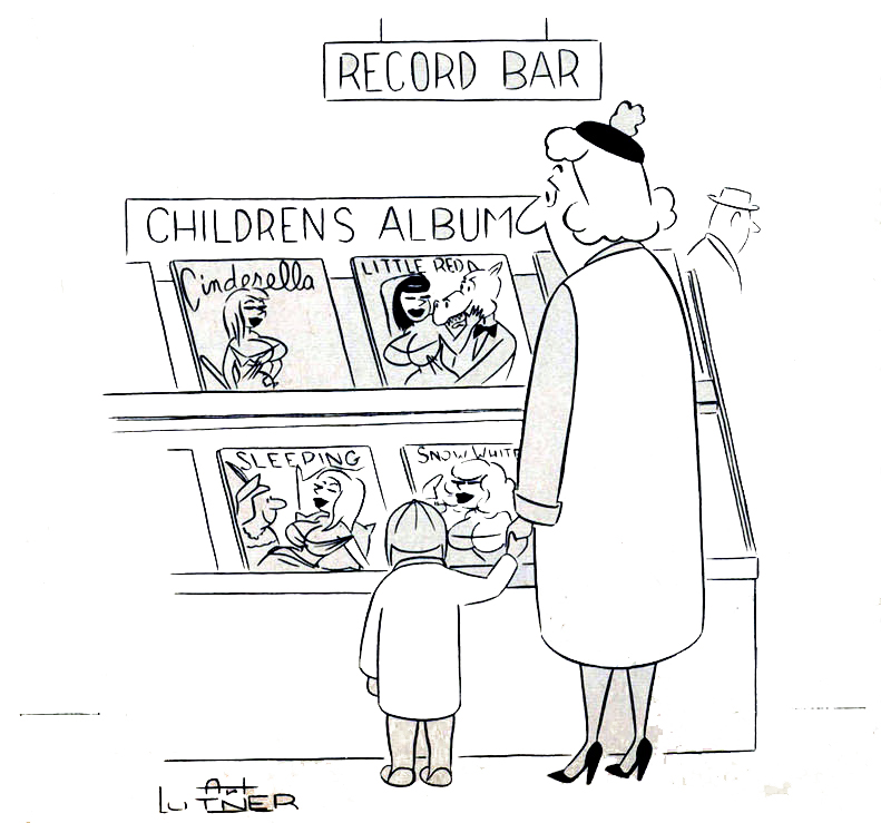
The following cartoon by Art Lutner from Bachelor #2 (1961) is a good example of the logical progression of the use of sexual imagery to sell records and would have rung true with most readers of the era.
While Lutner was making a comical statement about using sex to sell children's LP's he wasn't far off from reality. Quite often advertising for children's products is aimed at the adult who holds the money and has little to do with the content of the purchase.
Posted by
Sleestak
at
8/24/2011 06:00:00 AM
0
comments
Labels: Art, illustration, Marketing, sex sells
Friday, August 19, 2011
From the Collection: Glory Lane
Alan Dean Foster rarely delivers a bad read and he typically adds a lot of depth to slim scripts in his adaptations of movies and other shows. His Flinx universe is a favorite of mine even though the publishers have been marketing the series the last few years as Young Adult and not mature science fiction.
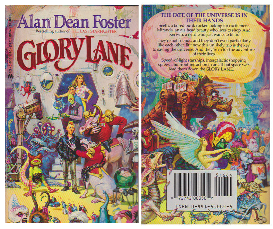
Glory Lane is a fun time though it is the cover I find interesting. Not so much for the unique aliens crowding the interstellar bazaar but the fact that on the back cover the bar-codes in the background above the actual fourth wall-breaking UPC code were scribbled out. It's amusing to think that the publisher was concerned that 1978 scanning technology would have been interfered with by the faux codes in the background. It's also possible that the UPC labels on the mech-dino would have been the place holder for the actual UPC code given different art direction and layout if a close-up of the tourist transporting walker were discarded in favor of the UPC-toting aliens. If so, good thinking by artist Jim Gurney, planning greater flexibility in his art to decrease chances of rejection or having to repaint the scene.
Glory Lane (1978).
Posted by
Sleestak
at
8/19/2011 06:00:00 AM
7
comments
Labels: Art, book covers, From the Collection, illustration
Wednesday, August 10, 2011
From the Collection: Stalker from the Stars
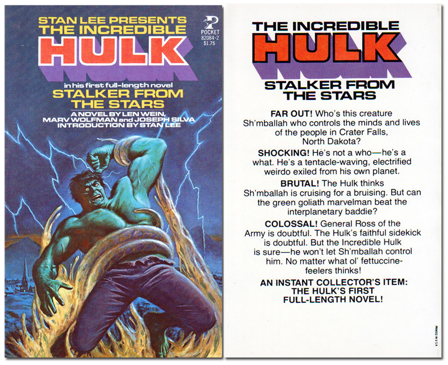
Those unfamiliar with Marvel comic book history would find the Hulk prose novel Stalker From the Stars reminiscent of cold war SF cinema but the book is really a blend of a 1950s Atlas/Timely alien invasion story (inspired of course by real world fears and concerns) featuring an un-evolved 1970s Hulk. This had precedent at the time as several Marvel heroes had come up against old villains from Marvel's SF and Horror books of the past. While the dialog of SHIELD agent Clay Quartermain made me want to travel to the Fictionverse just to beat him up overall the book is not a bad read for a young adult novel.
Front and back covers of Stalker from the Stars (1978).
Posted by
Sleestak
at
8/10/2011 01:01:00 PM
1 comments
Labels: Art, From the Collection, hulk, illustration, Pulps
Sunday, August 07, 2011
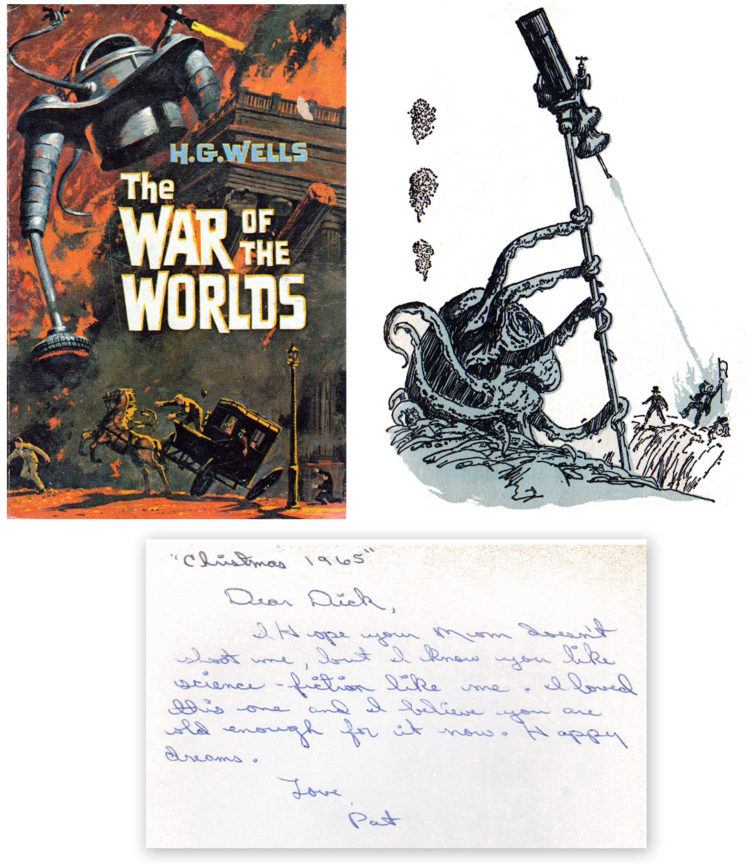
Don't you wish your martian was science-fiction like me
Found in my copy of a 1964 Whitman Publishing edition of The War of the Worlds by H. G. Wells, the inscription reads:
"Christmas 1965"This edition has illustrations by Shannon Stirnweis throughout the book but most are rather generic scenes of people in Victorian era clothing standing or sitting around. The one standout illustration is the fatal first contact scene between the Martian invader and the Deputation team of Ogilvy, Stent and Henderson. I also dig the cover art and groovy SF typeset.
Dear Dick,
I hope your mom doesn't shoot me, but I know you like science-fiction like me. I loved this one and I believe you are old enough for it now. Happy dreams.
Love, Pat
Posted by
Sleestak
at
8/07/2011 09:04:00 AM
3
comments
Labels: Art, From the Collection, illustration, Science Fiction
Friday, August 05, 2011
Did you have to include the hair?
Posted by
Sleestak
at
8/05/2011 05:59:00 PM
0
comments
Labels: advertising, Art, Grocery Store Artifact, illustration
Monday, July 11, 2011
The Million-Dollar Pixie
Years before Cosmopolitan magazine became known as Cosmo and advocated that liberated, independent, strong, intelligent and powerful women keep a married man on the side to help pay the bills movie star Hayley Mills appeared on the cover, goofing around and reinforcing a young image.Cosmopolitan used to be a well-rounded periodical of not only light articles but some in-depth investigative stories as well. From the December 1962 cover Hayley Mills talks about how her family keeps her grounded, the ways the young women of Moscow are defying Cold War stereotypes of behavior and fashion and the growing number of adults who are taking care of grandchildren born by unwed mothers. I'd like to present the Hayley Mills family-centric article "The Million-Dollar Pixie" in its entirety but laying the magazine flat enough to scan the pages would cause them to separate from the binding. I'll leave that sort of damage to those who cut ads and art out of vintage magazines and sell them online. So instead of the fascinating Hayley article I'll present a few pages of interior artwork instead.
Like many other magazines of the time a lot of page space was filled with fiction and non-fiction stories. For my tastes it isn't so much the writing and authors that are of interest but the art and illustrations that accompanied the stories. Frequently the art is classic and highly skilled and is widely appreciated as a stylistic snapshot of the era. Of all the art in this issue of Cosmopolitan it is the two pages that accompany the "complete mystery novel" Snow Job by Malcolm Gair, illustrated by Mitchell Hooks that I like the most. I've got a thing for duo-tone (or nearly so) magazine illustrations.
her long tanned fingers and stopped him. "You're doped," she said.
On top stood a figure with a large stone poised to throw.
Posted by
Sleestak
at
7/11/2011 06:00:00 AM
0
comments
Labels: Art, Hayley Mills, illustration, Monday with Hayley mills
Tuesday, April 05, 2011
Outstanding in his field
I'm really enjoying the new Avengers series primarily for the JRJR art though I'm not hating the story direction either.
In particular I appreciate this scene from Avengers #6 (Dec 2010) of Ultron standing at the crest of a pile of debris.
This panel conveys a real sense of horror and menace from the human-hating robot Ultron. In the past Ultron or any other villain, when shown as victorious, would usually be depicted standing in a vast control room or city that is an extension of itself. While visually appealing it also became somewhat of a cliche and usually the cause of the antagonist's defeat. A super-intelligent robot wouldn't really need to sit on a throne or connect to the internet though it looks good in CGI cartoons.
In the comic Ultron was placed in a scene where the robot's essential binary nature was revealed. Ultron is either ON or OFF, at ZERO or ONE. Having completed the directive to erase humanity from the planet Ultron stops in mid-step, inert until it is prompted to proceed again. Like an anti-life Roomba, Ultron apparently just walking the earth until the program was fulfilled, having extinguished all life. That's scary.
Posted by
Sleestak
at
4/05/2011 06:00:00 AM
1 comments
Labels: Art, illustration, Robot
Monday, February 07, 2011
Art is Food
My current dietary choices do not include chips and other snacks these days but I found this store branding of munchies clever and unique. The product is identified on the bag and draws attention by the cute doodles centered around a chip or cheese puff. As marketing goes it is a pretty nice effort and goes beyond what one usually sees for labeling for a generic store product.
There are several illustrations but my favorite is the potato chip mouse being threatened by a venomous snake.
Posted by
Sleestak
at
2/07/2011 02:00:00 PM
0
comments
Labels: advertising, Art, Grocery Store Artifact, illustration
Saturday, December 25, 2010
Merry Christmas and Happy Holidays for 2010!
Posted by
Sleestak
at
12/25/2010 06:00:00 AM
1 comments
Labels: Art, christmas, Holidays, illustration, Snow
Thursday, November 18, 2010
Meet Russell Stamm
Posted by
Sleestak
at
11/18/2010 08:00:00 AM
0
comments
Labels: Art, artists, illustration
Sunday, October 24, 2010
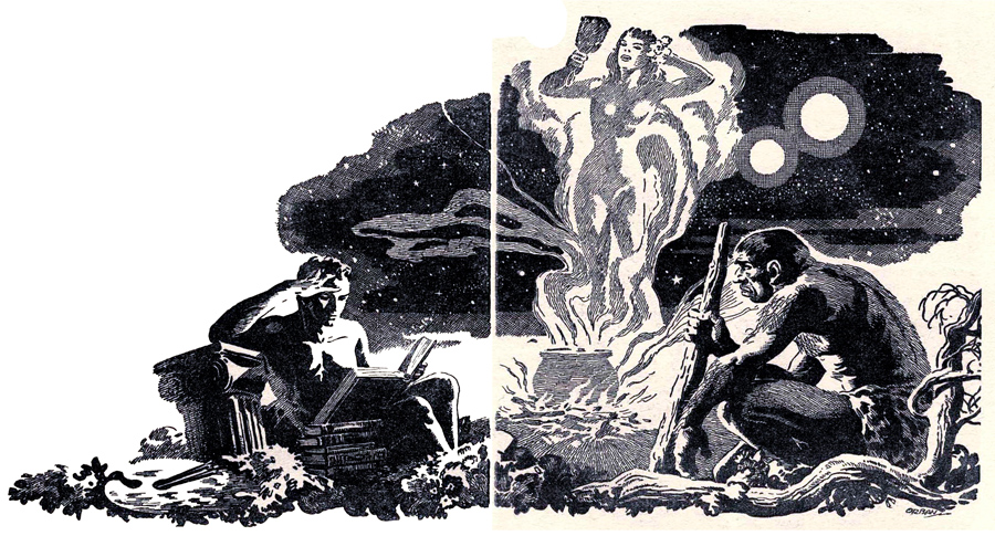
The Two Shadows
From The Two Shadows, published in Startling Stories (March 1951). Story by William F. Temple with art by Orban.
Posted by
Sleestak
at
10/24/2010 11:07:00 AM
0
comments
Labels: Art, illustration, Pulps
Wednesday, October 13, 2010
Sammy, The Sociable Seal
Posted by
Sleestak
at
10/13/2010 06:00:00 AM
0
comments
Labels: animals, Art, From the Collection, illustration, seal
Friday, September 10, 2010
Man, I don't even know
Posted by
Sleestak
at
9/10/2010 11:14:00 AM
2
comments
Labels: Art, book covers, fantasy, illustration
Monday, August 30, 2010
Dying is easy, it's math that's hard
Posted by
Sleestak
at
8/30/2010 02:30:00 PM
0
comments
Labels: Art, george tuska, illustration, math
Tuesday, August 24, 2010
5 Fingers
Been watching a lot of noir lately and came across this poster for the movie 5 Fingers (1952).
Poster art seems to be a lost skill these days as research shows that big giant, recognizable heads heads on a display is what sells tickets and DVDs. Compare the original 5 Fingers poster with the DVD packaging for the 2006 remake Five Fingers, loosely-based upon the original.
But it isn't the evolution of movie art that moves me today. Fashion is. The original 5 Fingers poster inspired me to make a proof-of-concept glove inspired by the poster.
I could totally see some hot, dangerous, billiards-playing woman wearing a glove with LUST, GREED, PASSION, DESIRE and SIN embroidered on the fingers in heavy, silver metallic thread. Any wolf that got fresh with her would end up having those words bruise-embossed into his forehead.
Hmm. This idea will probably be ripped off and for sale in a Hot Topic or an Etsy store within the month.
Posted by
Sleestak
at
8/24/2010 04:10:00 PM
0
comments
Labels: Art, fashion, film noir, illustration, movies, provenance
+-+p0029.jpg)