 In what became known as the self-proclaimed Marvel Age of Comics, new heights of quality story-telling in comic book art was achieved by ground-breaking artists like Ditko, Steranko and of course Jack Kirby. Steve Ditko in particular stunned readers with his wonderfully bizarre landscapes of surreal dimensional space while drawing Dr. Strange in the Strange Tales anthology series of the 1960's.
In my opinion some of Steve Ditko's best 1960's work was during his tenure on Strange Tales. Art that was at first average swiftly improved in creativity. It appeared as if Ditko wasn't all that interested in Dr. Strange at first or was not sure what direction to take it creatively. It was somewhere in the story arc with Strange fighting to survive against Super-Villain Team-Up of Dormmamu and Mordo and while seeking the cosmic entity Eternity that Ditko really seemed to start to care about the character and the work that he put into the book. It was this period I have come to think of as Ditko Unleashed.
After Ditko ended his tenure other illustrators stepped in to perform the art duties, most notably, Marie Severin. Other artists, while competent enough, were not in Ditko's or Severin's class and had to refer to outside sources for their inspiration. One of these artists was science fiction aficionado and fanzine editor Dan Adkins.
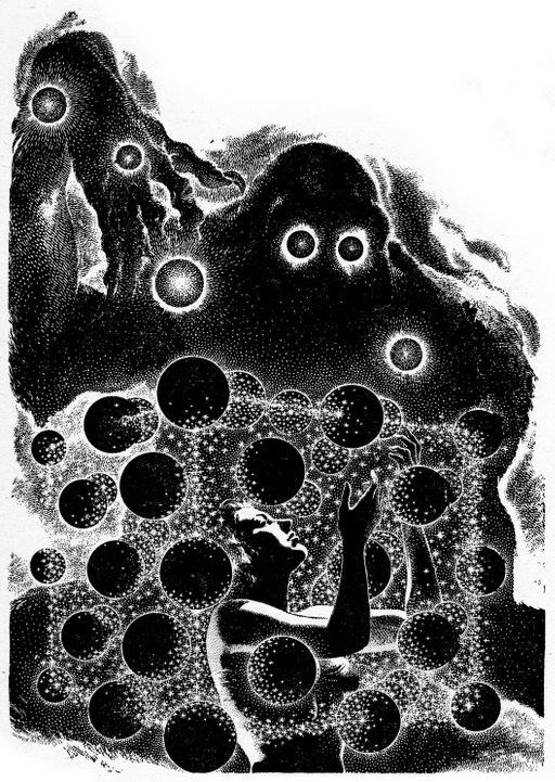
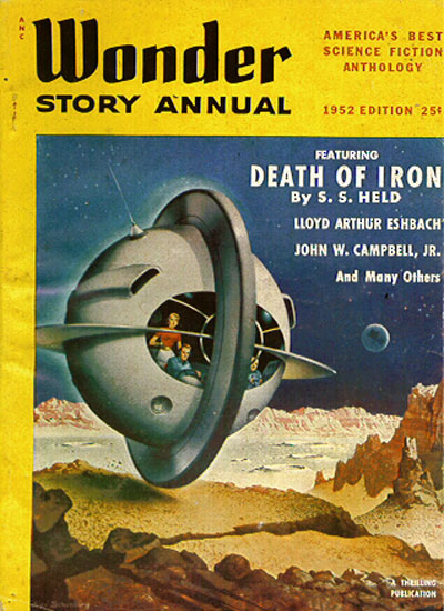
While browsing Datajunkie's site I rediscovered this classic science fiction image, drawn by the great pulp and SF artist Virgil Finlay for the for the reprinted S.S. Held story, The Death of Iron in the 1952 Wonder Stories Annual.
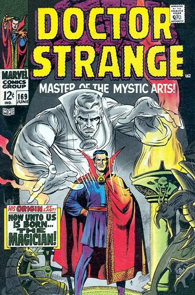
The picture rang some bells so I looked through my Dr. Strange collection and found this page depicting a worried Stephen Strange contemplating threats from other worlds in Dr. Strange, Master of the Mystic Arts #169 (June 1968, v1).
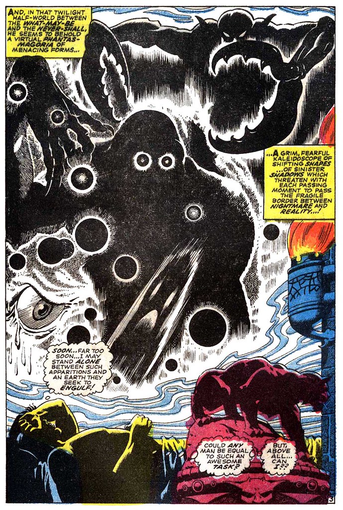
It is a safe bet that before the internet and greater interest in pulp magazines it was easier to use another artists' work as a muse and have the swipe pass unnoticed by fans. It's unlikely that other professionals did not recognize the origin of the image but I bet this page made the kids' eyes bug out when they saw it (Scenes like this are also part of the reason why Dr. Strange was a must-read title among college students back in the late 1960's).
This swipe is as obvious, though ultimately a bit more harmless in its deception, as the one spotlighting Bob Kane's artistic integrity and creativity vis a vis Batman, as related at the Vallely Archives.
Tuesday, June 20, 2006
Dr. Strange, Master of the Swiped Art
![]()
![]()
Subscribe to:
Post Comments (Atom)


I wish somebody would publish a book, or write a really in depth article on the great comic book swipes. A lot of subpar artists did indeed swipe out of necessity, but others often did it openly as an homage to the swiped artist. My favorite is the Hal Foster design Jack Kirby borrowed for Etrigan.
ReplyDeleteI love this sort of "detective work". I just commented on another blog about this very subject, specifically the Kane thing and the "secret origin" of Jimmy Olsen, Turtle Man" that Mark Evanier and Gary Sassaman brought up.
ReplyDeleteA fan of pulps, I posted about that Jimmy Olsen thing a while ago also. I'm not the first to notice that obviously, I've seen mention of that going back years. Also I once posted about the similarities between an Invisible Man pulp and a DC comic cover.
ReplyDeleteIn Brandon's link the concept of an "honest swipe" is mentioned, where the artist acknowledges that the art or story concept is an homage or inspired by another's work.
For instance, there are a few Frazetta paintings that bear a resemblance to Fiction House covers. But Frazetta worked in a similar genre and there are only so many poses a spear-weilding girl and tiger can take.
Incredible. I love the fine art of the comic book swipe! The trick is to make sure that no one can trace back to the source.
ReplyDeleteAha! I knew I'd read about the Jimmy Olsen thing before. I think Dial B For Blog also covered it a while back.
ReplyDelete"Marie Severin (who rendered the first interdimensional fanged mouth, by the way)"
ReplyDeleteThere's a fanged mouth with a path going through it in Strange Tales #116 "Return to the Nightmare World", by Ditko.
Great swipe find!
Adkins was actually caught at this some time ago. I seem to recall reading (ALTER EGO perhaps?) that even Marvel caught it and that this was the reason he didn't stay with the title very long. The example I saw was the montage of Strange as a physician but I don't recall from where it had been swiped.
ReplyDeleteThere's a fanged mouth with a path going through it in Strange Tales #116 "Return to the Nightmare World", by Ditko.
ReplyDeleteDarn! I knew I saw it somewhere but it was making me crazy trying to find it. I missed that panel in my search. Thanks for the info.
Interestingly, it appears the heavily Ditko-infuenced Jim Starlin was one of the few artists that bothered to draw the mouth much as Ditko did in his Warlock series, an issue of which he dedicated to Steve Ditko for the inspiration.
I also thought the other demonic entities in the page were familiar also, particularly the giant eye. I initially thought it was from part of a Wally Wood piece, and then I remebered Adkins worked under him. If not another swipe, then it would explain the similarity of styles.
ReplyDeleteAdkins was THE quinessential swiper.
ReplyDeleteThe aforementioned (in the comments) Medical scene swipe was a page in # 169 showing DOC during his surgical years, and was taken line-for-line from the cover of M.D. # 1.
If you read thru Adkins tenure on DOCTOR STRANGE you'll see MANY pose swipes from Ditko's Strange Tales run.
MANY.
I started looking for them once and found so many that I had to quit it in disgust.
Still, his cover illo to # 169 is my FAVORITE COVER of ALL TIME.
I PRAY it is 100% original.
Oh. And personally, I found Marie Sevarin to be a horrid illustrtor for DOC.
SHe aped some Ditko, but her work was too "grounded" and pedestrian for the title.
And the inks (Idon't recall if they were hers or not) were sloppy.
After Ditko, I found Bill Everett to be fantastic on DOC.
His work was smooth and hip.
Still and all, Adkins work is still looked on favorably by me.
VERY good illustrator. Just wish he didn't SWIPE so damned much.
~P~
P-TOR
OK...I just flipped thru Marie Severin's run.
ReplyDelete(I wanted to be SURE she was as bad as I remembered and accused her of being.)
For the MOST part, yes, her first few issues S.T. # 152, 153, were godawful!
Her figurework was very dynamic, but some foreshortening was really wonky.
Even if her pencils were good, there was no way to know since the INKING was ham-fisted.
Coming right after Everett's smooth, polished linework, Severin's looked like a bad rush job (which, perhaps it may have been to just meet a deadline).
# 154 was bad, but not horrible.
Action sequences were exciting and dynamic, but the finished work was still sloppy and awkward.
# 155 she started to get a bit of a feel for it.
Some really good moments in these.
Figures are dynamic, action is gripping and inking getting a bit better.
# 156 was VERY cinematic! If not for the poor inking, this could have been a masterpiece! Her COVER to the issue stands as one of DOC's BEST!
# 157 started a nice turnaround!
First off, Herb Trimpe inked it.
SO that added some polish.
And while her visualization for the spells, like "Seven Bands of Cyttorak" looked like bad Spirograph, the rest wasn't bad at all.
ZOM was never my favorite villain, but the visual IS imaginative.
However, her crowning achievement here was the creation of the LIVING TRIBUNAL.
Simple. Elegant. Cosmic.
# 158 (with it's full page image that PINK FLOYD swiped for SaucerFull of Secrets) , 159, 160 were much, much better!
Oddly, 159 had her inking herself again, and the quality suffers a little.
But 160 brought back Trimpe and the diference is noticable.
However, her layout and general artwork had greatly improved.
In my humble opinion, # 158 being the best of her bunch.
LIVING TRIBUNAL was some heady stuff.
SO, overall I'll grade her a 7 out of 10. Not bad. Some gripping dynamics, but the inking really made her lose points with me.
I'm still on the fence if her work was "weird" enough for DR STRANGE.
My instincts say "no", but her work DID have some really NICE bits and pieces here and there.
SO...I guess I DO owe Marie Severin an apology.
I've held her as the worst DOC artist, in my mind, for YEARS.
She was not.
~P~
P-TOR