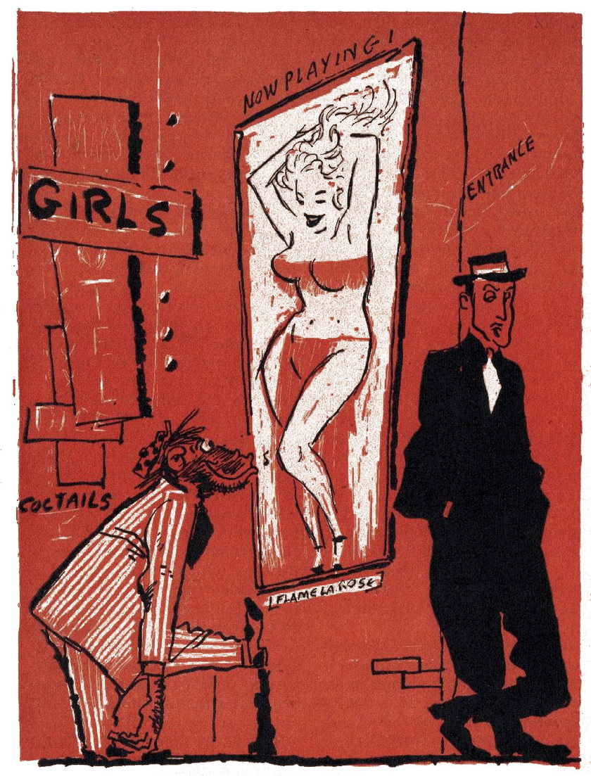
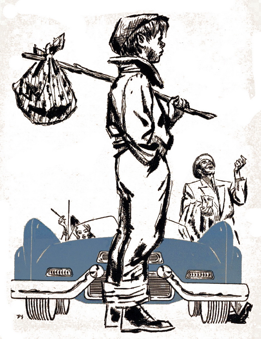
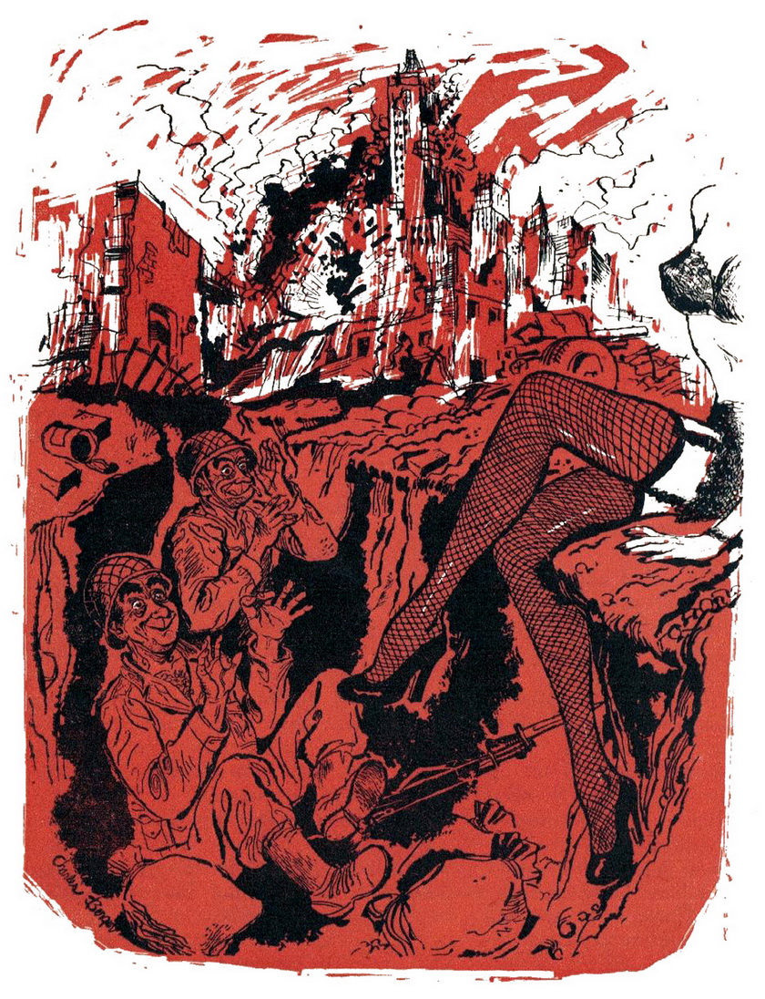
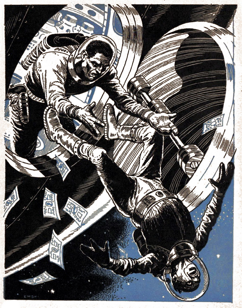
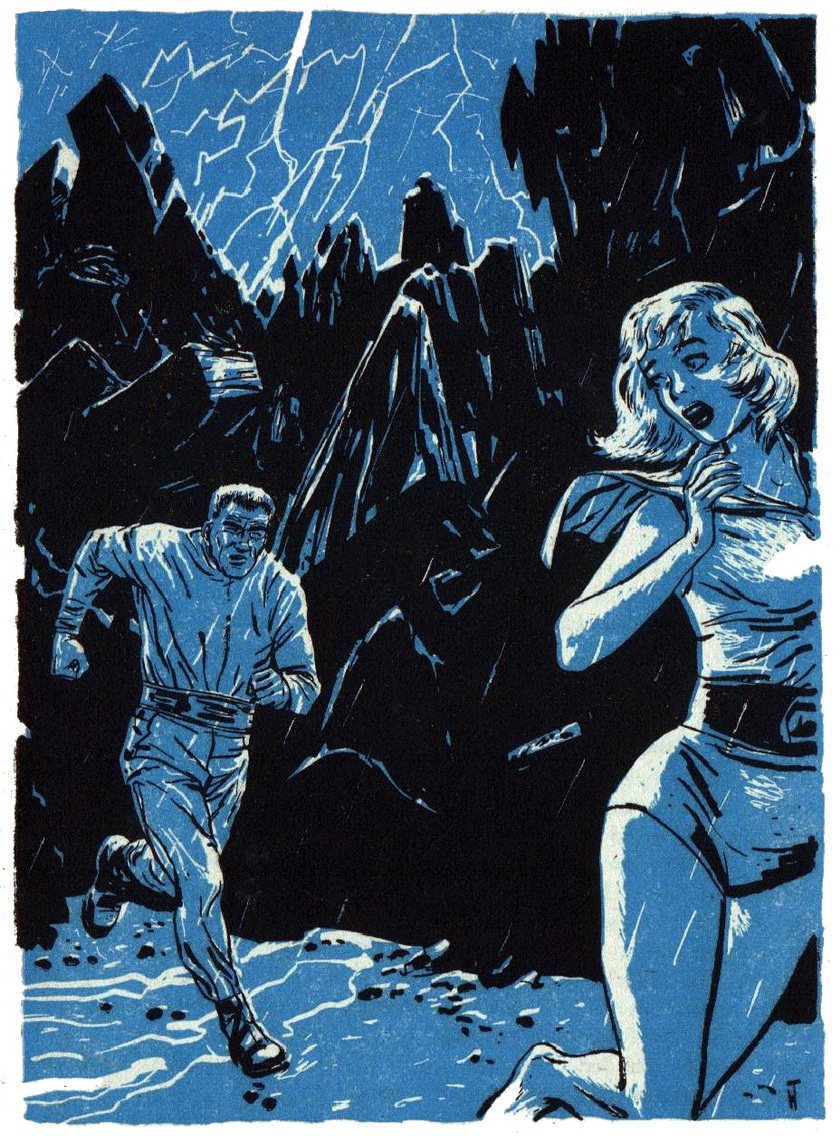
One of the more attractive aspects of the magazine and book illustrations of the 1950s is the two-tone printing process. A simple highlight of color could really make an illustration stand out and give added emphasis such as lust, fear and danger to the line art. While applying a single hue other than black to an illustration may have its true origin in economical publishing, the printing process itself created an art style that was unique and defined a creative era.
Amazing Stories (April 1953).
The Night the Game Twister Went Mainstream
2 hours ago




Neat!!
ReplyDelete