Recently in my area the Food Lion chain of stores changed their name to Bloom. The interior of the one I patronize is nice enough and appears a little more upscale, which is a welcome change for the area. The Food Lion corporate persona had a 70s look and inefficient layout. The upgrade fits the locale better, catering to the demographic who will be occupying all the condos being built in the area.
The Food Lion symbol is distinctly old world and is busted. As part of its new hotness and corporate green-imagery the Bloom stores have as their logo a stylized flower, signifying nature, health, natural foods and rampant tree-huggery.
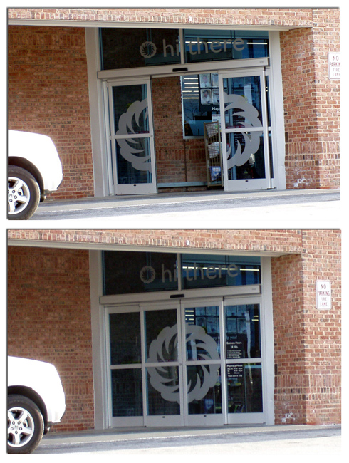
 horrific beast. The logo on the entrances looks amusing when the door is in operation, belying their harmless, earth-friendly appearance. When a customer approaches the doors they open wide like the jagged maw of some Lovecraftian behemoth to engulf hapless prey. They then snap shut behind them as the customer is pulled to a horrible death. Or waits behind someone who has too many items for the express line. Either or.
The door decal and the way it operates reminds me of the National Geographic advertisement about sharks that appeared on some buses a while back.
Disclosure: In case anyone was wondering, I have never worked for Food Lion or Bloom and their companies are not a part of any of my previous behind-the-scenes Grocery Store Artifact posts.