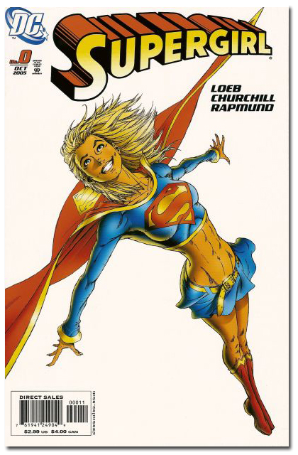
Why is this cover and version of Supergirl considered exploitive...
But this one isn't?
Tags: Seduction of the Innocent Supergirl
(If 'feministical' wasn't a real word before, it is now.)

Why is this cover and version of Supergirl considered exploitive...
![]()
![]()


Because, The one in white is a 20 something year old, the one in blue is 16. Also loose skirts tend to fly up a lot easier then tight skirts
ReplyDeleteI consider them both pretty tacky and exploitive to be honest, but the Churchill images edges out the other one because she's showing FAR too much of her pubic region for a character who is supposed to be a teenager.
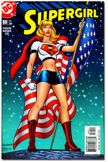
ReplyDeleteLace-up boots make up for a multitude of sins.
ReplyDeleteThe second one *isn't* considered sexist?
ReplyDeleteBy whom?
(How does she kick in that skirt? It's welding her thighs together!)
Generally, the White-T Supergirl isn't considered "as bad as" Superlolita. Maybe has something to do with the perceived intention of the character by the creative teams?
ReplyDeleteYou're right, they're both disgusting. Put her in some pants for heaven's sake.
ReplyDeleteThey both make me really, really tired. I don't want to see if she's got a Brazilian in either one, and with her first bounce up it is a risk.
ReplyDeleteWhat is it with these artists? Why is it so damned hard to envision Supergirl as cute and CLOTHED?
Tarted up, nearly nude and faux-nude = $$$$$
ReplyDeleteCute and clothed = Pennies
The first is more *obviously* sexist than the second. I'm going to ignore the clothing issue for a second here, so bear with me.
ReplyDeleteIn the first, her anatomy is grossly distorted, her pose is ridiculous, and her chest is thrust toward the viewer in an obvious, wiggly-jiggly-hey-look-at-me! way. You would probably never see a man drawn in that pose. Unless he were being punched and sent flying out of a panel, that is.
In the second cover, at first glance her anatomy looks, meh, passably okay. By comic book standards it is the "norm" anatomy for a female; a couple ribs and some internal organs missing, but that's par for the course in comic book art, and perhaps we've been conditioned to accept "par for the course" as "correct" anatomy. But her pose, on the other hand, is awesome - powerful, authoritative, strong. I've seen plenty of men standing in that exact same pose. Sure, her face looks a bit spacy, but maybe the artist failed just short of being able to draw a "determined" face.
The outfits, of course, are similar. And stupid. And sexist. But at least the second cover - in terms of pose and anatomy - is a vast improvement over the first.
So the second cover is, er, relatively "less" exploitative than the first.
"Dance, my puppets. Dance!"
ReplyDelete"How does she kick in that skirt? It's welding her thighs together!"
ReplyDeleteHaw! I miss the old 1940's-1950's "skating outfit" style of superheroine skirts, that ended just above the knee and had a lot of fabric that could flounce playfully about during battles. Sadly, they won't come back into fashion until my home era of 2964. Triplicate Girl really knows how to rock one of those.
good god, she's cadaverous in that first picture. her limbs are like toothpicks. ugh.
ReplyDeleteBecause the 2nd one is done by comics industry sacred cow John Romita.
ReplyDeleteLook, BOTH are pretty bad and exploitative titillation-minded costume designs.
ReplyDeleteBut, the 2nd cover has that "Gwen Stacy" headband.
It "tames" her and makes for a more "innocent" exterior.
(Yet, it SCREAMS buttoned-down, but sexy... to me anyway.)
Oh, and yeah... beloved Uncle of "good girl" art... Jazzy John Romita drew it.
But that 1st one.
- she's waaay underage
- that skirt isn't much wider than her BELT, (which is slung down so LOW I think I see labia)
- The MOST offensive thing about it is the "so-badly-drawn- it's-criminal-that-he-gets-
a-paycheck-Michael Turner-
1st-grade-art-education anatomy"!
GAH!
~P~
P-TOR
Is this a rick question?
ReplyDeleteThey both stink.
How does she kick? Isn't she Supergirl? Is mere skirt fabric a new weakness for her on a line with kryptonite?
ReplyDeleteOkay... yes... both are scantly clad, and yes, the comic bok industry tends to portray it's female favourites in tight, revealing outfits... most of which are no worse than the average highshcool girl wears anymore...
ReplyDeleteand as for Micheal Turner's drawing skills... anyone else here want to attempt to draw a flying character in forced perspective while trying to capture movement and make it pleasing to the eye? It ain't as easy as it looks... trust me.
we should al stop worrying about how short Super Girl's Skirt is and worry more about raising our kids so they know the difference betyween slef expression and a cry for attention.
It's the smile and the arched back
ReplyDeletevs.
The "bland" look and the clenched fist.
Simple sex-appeal.
This comment has been removed by the author.
ReplyDeleteThe difference in perception all has to do with the power (or lack thereof) that the main character seems to posess as well as the streamlining and masculinity of the costume. In the second she is standing tall and proud, shoulders back, chest out and ready to dominate. In the first, she's angled as if to be lying there in her flimsy skirt seeming more like the damsel in distress than a super hero.
ReplyDeleteCuriously, in the second it really looks as though she were drawn nude and the edges of the skirt were just added as an afterthought shortly before coloring.
ReplyDeleteBut the facial expressions overwhelm all other considerations for me. The first SG appears to have been caught in the throes of a "private moment", where the second seems to be busy doing differential equations in her head.
HOW ABOUT GROW THE FUCK UP AND GET SOME PERSPECTIVE
ReplyDelete