I really like clicking through the Grand Comic Book Database and perusing the comic book covers of the past. The Golden Age covers are fun but I mostly enjoy checking out the Silver Age stuff.
Most of the GA & SA covers are pretty cool for reasons of nostalgia, but to me it is due mostly for iconic content and not the (in some opinions) dated art. The exceptions of course would be the classic Neal Adams covers for DC.
Every now and then you come across a cover that was not typical of the era. By that I mean the toned or wash covers, which were that much more difficult and expensive back in the pre-digital days of publishing. Extravagantly rendered cover art is par for the course today, but not so much in the Silver Age. Since the Golden Age featured some beautifully drawn, painted or toned art much of the time (pulp & comic artists could whip out several a week for an editor), it had to be expediency and expense that 'cartooned up' the monthlies and made them more simplistic.
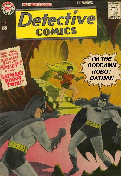
For instance, this cover from Detective Comics #239 (Jan 1957), that requires the inevitable word-balloon manipulation...
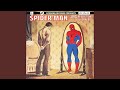
This great example is from Green Lantern #8 (Sept-Oct 1961).

A striking contrast to the sketchiness of the interior art.

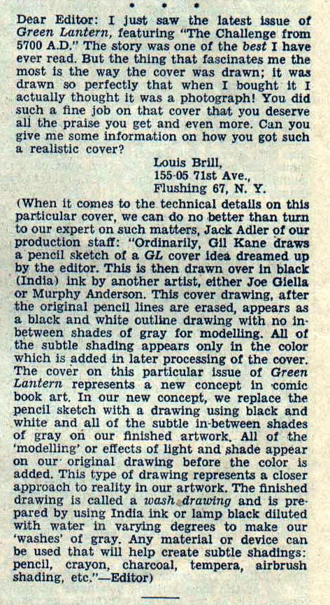
Here's a letter from Green Lantern #10 explaining how they did it.


No comments:
Post a Comment
Moderation enabled only because of trolling, racist, homophobic hate-mongers.
Note: Only a member of this blog may post a comment.