
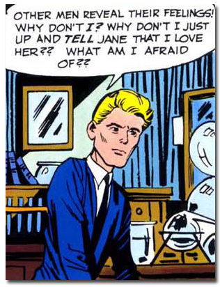
I get that Doctor Don Blake is lame as a way of being taught humility, but veteran comic book artist Al Hartley portrayed him way back in 1963 as if he was one of those novelty soda bottles that gets heated until it can be all stretched out and twisted. Truthfully, the idea of Blake being severely disabled (as opposed to having what arguably could be called an affectation) and barely able to function until he transforms into Thor is very intriguing. But I don't think this was what Hartley was going for due to the generally awful layouts throughout the story. It may be that Hartley pencilled and inked this issue on a very tight deadline but this is just painful to read, like the current New X-Men or the Wonder Man limited series.
Click for a slideshow of more twisted fun
I have no idea what Marvel was doing here. Blake is more anatomically incorrect than Supergirl. Well, at least it wasn't Colletta inking Kirby.
Pages from Journey Into Mystery #90 (March 1963).
Tags: Bad art


His Thor isn't much better. It looks like he's either got a giant forehead or is completely bald under the helmet.
ReplyDeleteWhat idiot is comparing this favorably to Colletta? Knucklehead!
ReplyDeleteI have to say I'm in total agreement with the previous poster. This, to you, looks better than Vince Colletta art? I suggest you start a new blog and review Archie and Jughead comics.
ReplyDelete